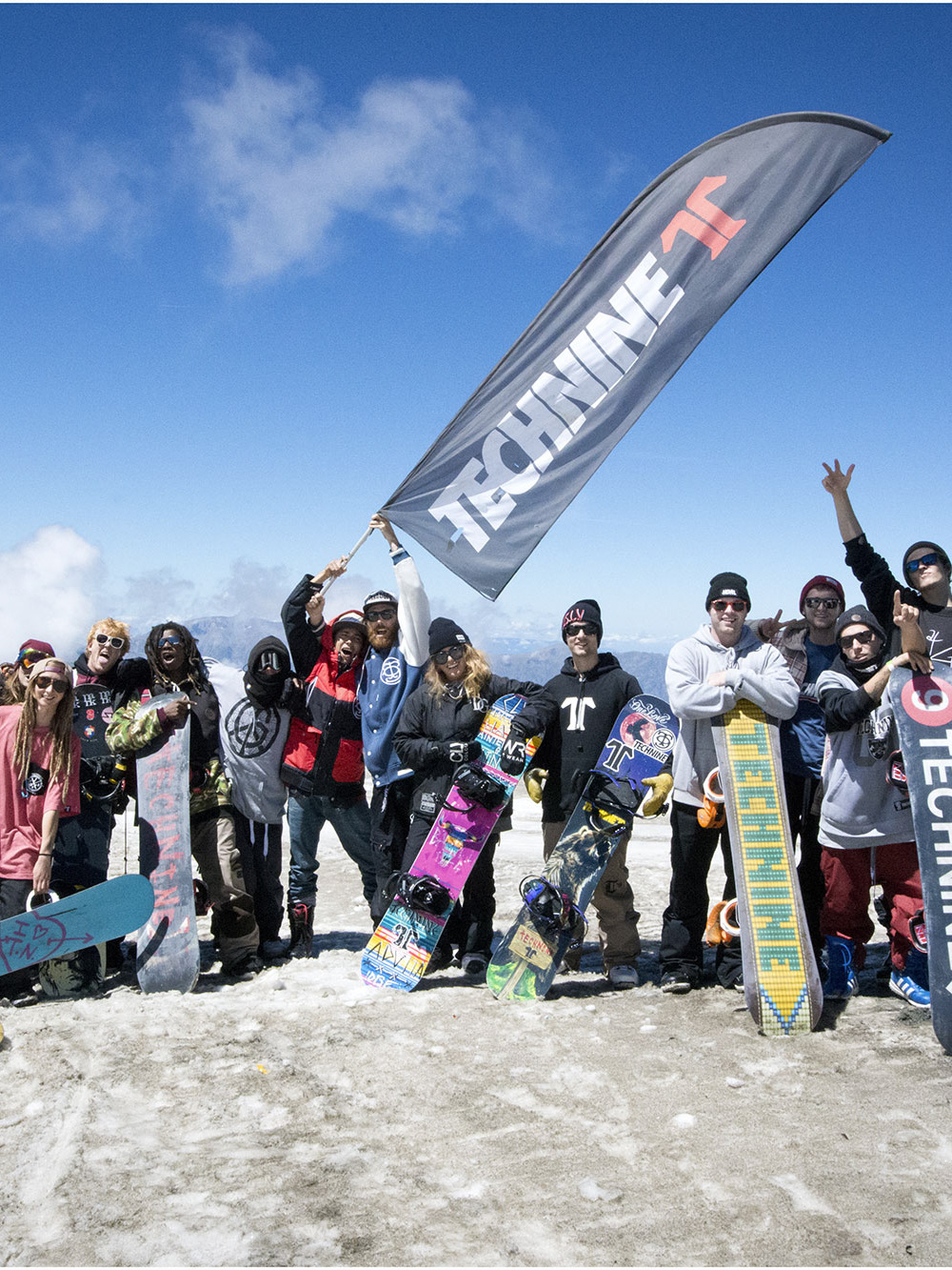
In 2021 we submitted a rebranding proposal to Northwave, an Italian snowboard boot manufacturer turned full snowboard brand along with their parent brands Drake and Venue. Northwave was born in Italy in the 90s and in a very short time became the leading boot brand in snowboarding. In the late 90s Northwave entered the US Market and became one of the strongest players in the snowboard footwear business thanks to its innovative products, cutting edge designs and rampant marketing. The proposal aimed to boost the comeback to the US market for the next seasons.
The whole proposal was built on two leading concepts: celebrate the brand heritage and build a sinergy among the product lines: boots, bindings and boards. Boots were the foundations of the brand, while bindings came later with Drake. In order to give boards division his own identity, on early 2K Northwave introduced Venue snowboards. The brand featured a very effective marketing and a pretty modern and Euro-centric take, but it was stopped after few seasons and the board line was merged under the Drake flag.
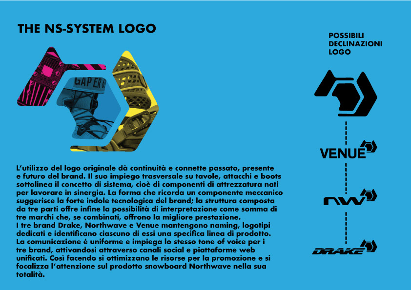
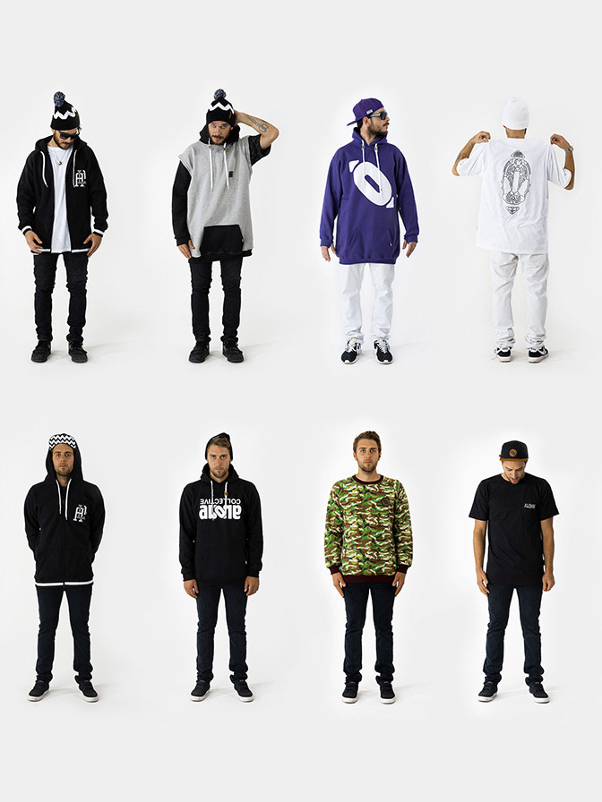
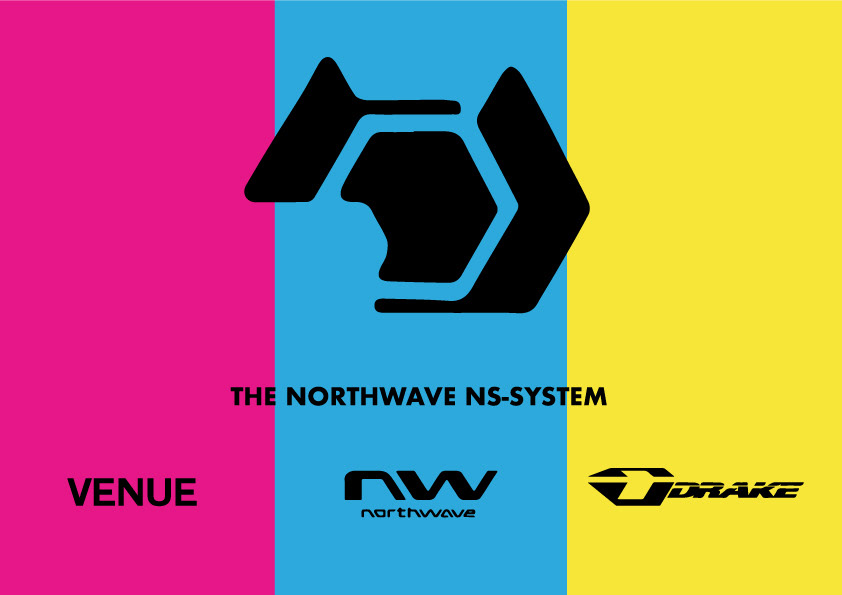
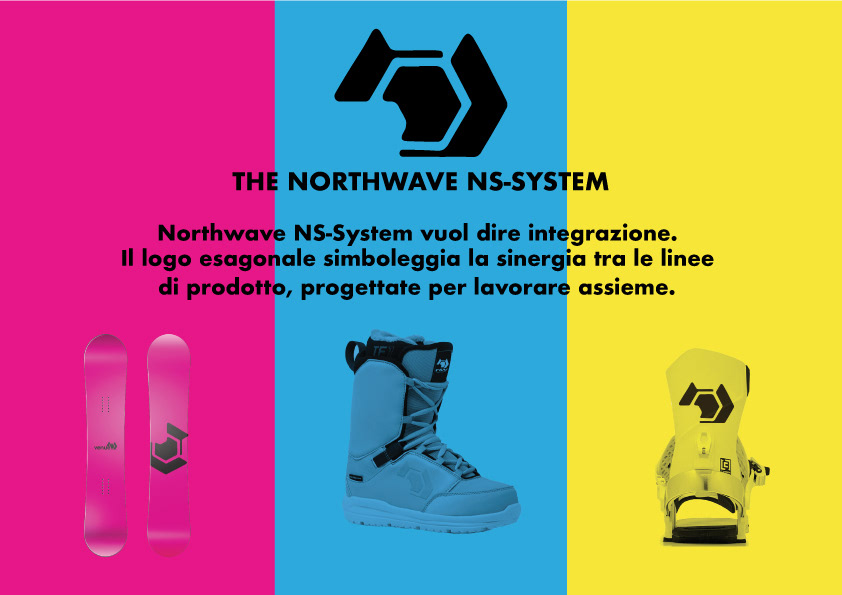
Al1 Supply came with the idea to revamp the Venue brand to create a proper board division, so to give each product line its own identity; then all the product lines came together under the NS-System umbrella. The mother brand was identified with the snowflake icon, and the three divisions were featuring the icon like an Apex in their own logotype. The snoflake icon was a direct link with the past since it was featured on the most of the boots. Moreover it was designed like three connected elements, so naturally recalled how the three product lines were designed to work together.
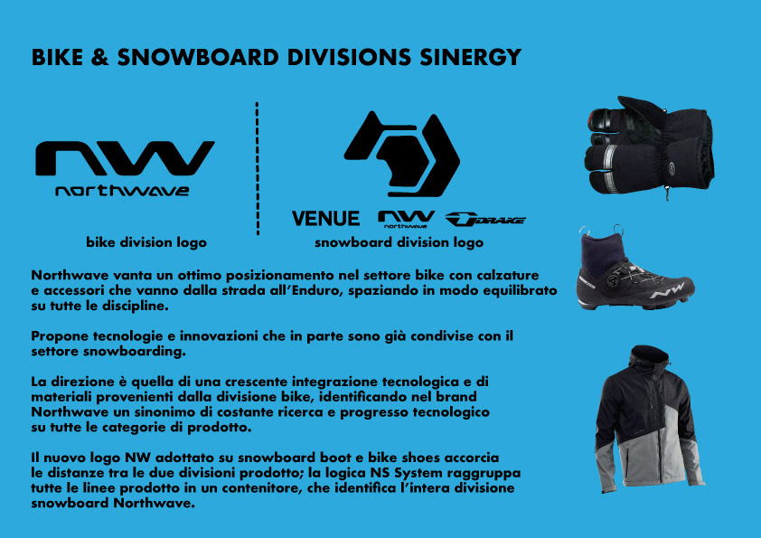
Northwave is also a top player into the bike footwear business and they've recently widen un the offering with bike apparel and accessories. This granted the snowboard division a free access to true and tested technologies. We suggested to point it out into the communication, yet keeping the snowboard division identity separated with the help of a slightly different imagery and language.
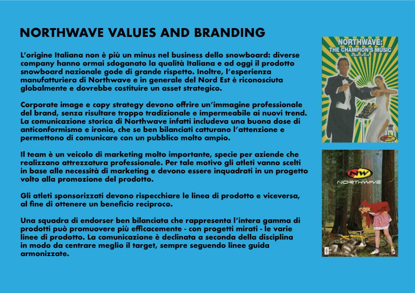
Advertising has always been a strong point for the bike division of the brand, so we suggested to bring back the irreverent approach into the communication language with without losing the focus on technology. Finally the Italian origin, which in snowboarding has always been kind of taboo, should have been pushed and revealed instead, because Italian manufacturing is recognized and respected worldwide.
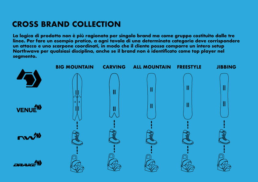
Product wise, the idea was to build a proper product grid with matching products through the three product divisions.
The collaboration never happened, though, because the management - working with another agency - decided to adopt a universal logo for the Norrhwave brand leaving Drake bindings and boards untoched. Anyway It has been really fun and challenging working on this idea.